

The universe of Martina Bayers

watch the video again
Your are the presentation!
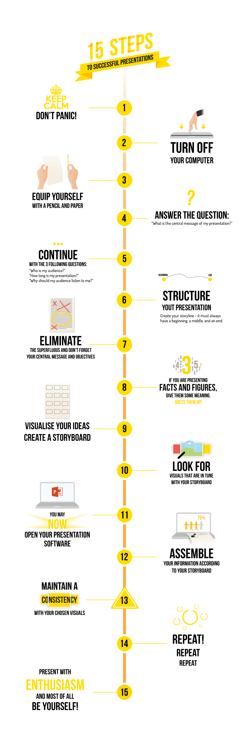
If you want to convince others and present your ideas differently and effectively, you will inevitably have to clarify and simplify your message, structure and enrich your ideas, develop a logical story and, ultimately, create memorable visuals. The aim of Presentation Design is to give you the tools to quickly and significantly improve the quality of your visual presentations.


THE ADVICE OF A PROFESSIONAL

TRUST THE COMPOSITION GRIDS
Are you looking to create a graphic line and to bring consistency to your presentation? Think of ‘composition grids’. Create a grid that will repeat itself from slide to slide within which you can place all the various elements. These composition grids bring clarity and cohesion to the presentation as a whole.

CREATE MOVEMENT, NOT ANIMATION
Get rid of all animations and transitions that serve no purpose, which will be almost all of them! Especially those intended to distract your audience … They are time-consuming, and what your audience really wants is for your message to be clear and for you to get straight to the point. Only hang onto animations and transitions that make sense, such as the (simple) appearance of elements that synchronise with your speech. Given some circumstances, a transition may allow you to tell a story, a journey through your presentation.

IT’S NOT A PRESENTATION,… IT’S A DOCUMENT
PowerPoint is frequently used to create documents. And why not, particularly since one must accept that word processors are not very flexible in terms of layout. If the ‘presentation’ format is clearly separated from the ‘document / paper’ format, and the latter is not (never!) projected onto the screen, then you should not have any major problems. Consequently, why not go further and create a real document layout? For example, transform horizontal text boxes into columns, often more suited to the document format. Need inspiration?


